Our main design principle is: Design the app in a way that you’d be ready to use it yourself every day at work.
We started to develop our app back in 2004 – and in these 18 years, pretty much everything has changed. But one needs to start somewhere, and already back then, the idea was there: we want to design the app to be as simple and efficient as possible.
Design the app in a way that you’d be ready to use it yourself every day at work.
Our design principle
First things first: mandatory requirements
The live views that updated automatically and simultaneously with the electronic health record were one of the major and mandatory improvements to the user experience of the Medanets app.
Another major factor that has affected the app’s user experience is the offline mode that was introduced together with the first version of the Android user interface that went live in 2016. We had learnt that offline capability is a mandatory requirement for an app that is used in a hospital setting. This is still true today – even the newest hospital buildings tend to have spots where the wireless network does not work properly. The offline mode is crucial also when using the app outside the hospital, for instance in home care.
Following these, professional user interface came into play.
8 seconds for the user
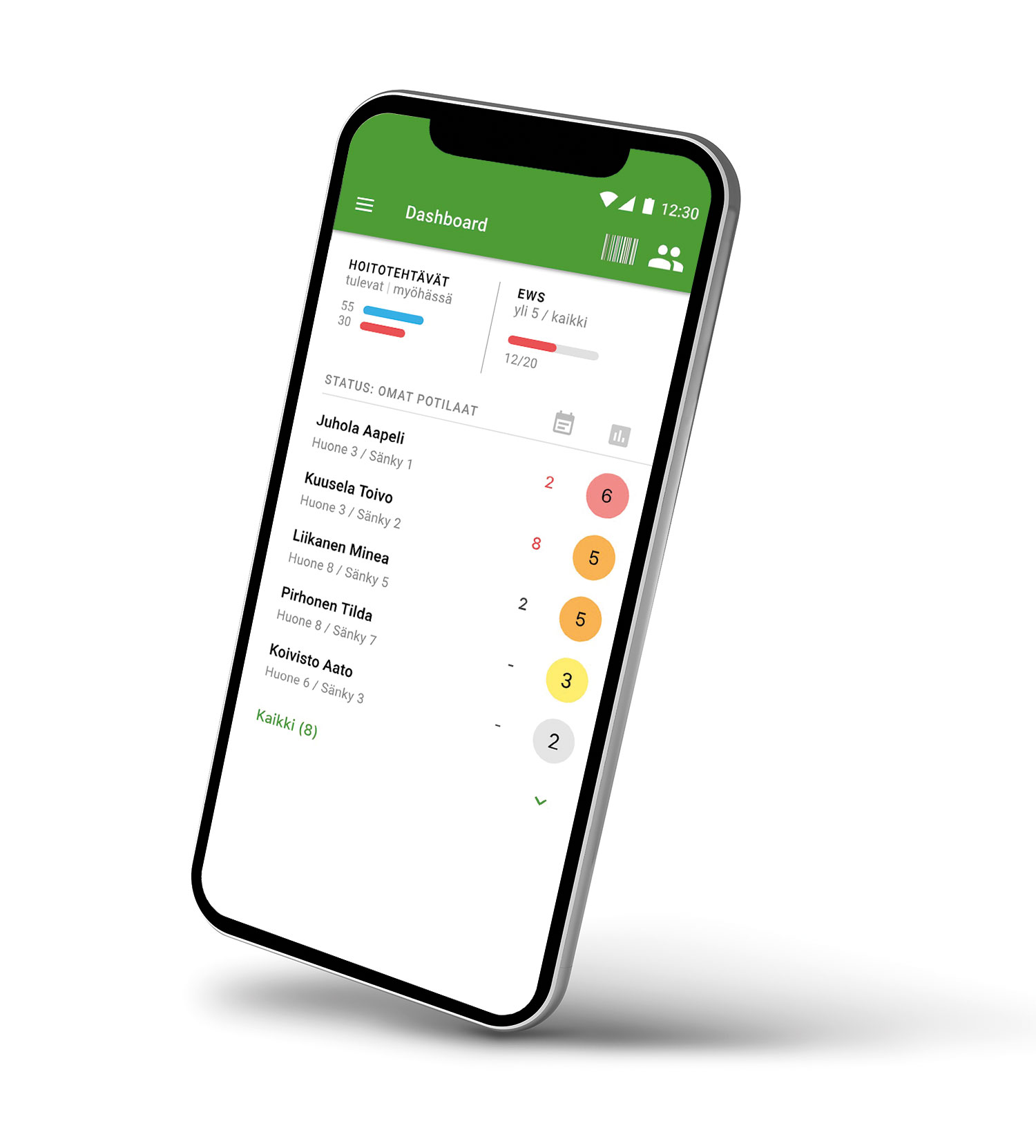
Earlier, the user had to scan a patient’s wristband and open a feature to start the work and use the app. By the time the user was ready with this, the data had been fetched from the electronic health record and was there for the user. Nowadays, the first view the user will see after login is the Dashboard, which gives an overview of both the situation at the whole ward and the individual patients’ conditions.
When we first designed this feature, it took 2-10 seconds after successful login for the app to fetch the data from the EHR and get it prepared for offline use. Yet, the Dashboard should be there in two seconds! After over two years of investing a lot of work and resources in these eight seconds, the redesigned service will be out in Q3 of 2022.
Eight seconds for the user, for each login event, because that’s how it should be. For the individual healthcare professional, eight more seconds saved, several times a day, each week, each month, each year, means a profound change for the better..
Our R&D’s long-term vision: the app is as easy and familiar to use as the apps on your personal device are. You can pick the device of your choosing for work – the same device you’ve accustomed to using at home.
Nowadays, our development focuses on workflow design instead of plain user interface features. This has become possible not only through our own increased competencies but also through the increased capabilities of the electronic health records we work with. Of course, all this is done in close cooperation with the best experts in healthcare workflows – that is you, our customers. To think of what we can achieve together next!

