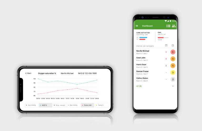
The new visual features make it easier than before to understand the overall situation of the patient and the ward. Graphs visualise the patient’s observation values as line charts over a selected period of time. The dashboard gives a clear picture of the situation of all patients admitted to the ward, in a single view.
The graphs allow for viewing the patient’s observation values in a visual format. You can see how the values have developed over a selected period of time. For instance, you get to see changes in the patient’s pulse and heart rate over the past 12 hours in an easily understandable format that immediately indicates the trend. The development of the Early Warning Score can also be viewed as a graph. The graphs are integrated into the observation values feature.
The dashboard, in turn, provides a summary of the condition of all patients admitted to the ward. Patients with the highest Early Warning Scores are shown topmost on the list, allowing the staff to predict which patients are most likely to require treatment first. The colour coding of the EWS makes the feature visually attractive and clear. The dashboard also shows the care activities that are due or late for each patient.
Used together or as separate features, the graphs and the dashboard help to understand the overall situation better than before and enable even quicker reactions to any changes in the patients’ condition. The new features of the Medanets app are available in December 2020.

