
Graphs
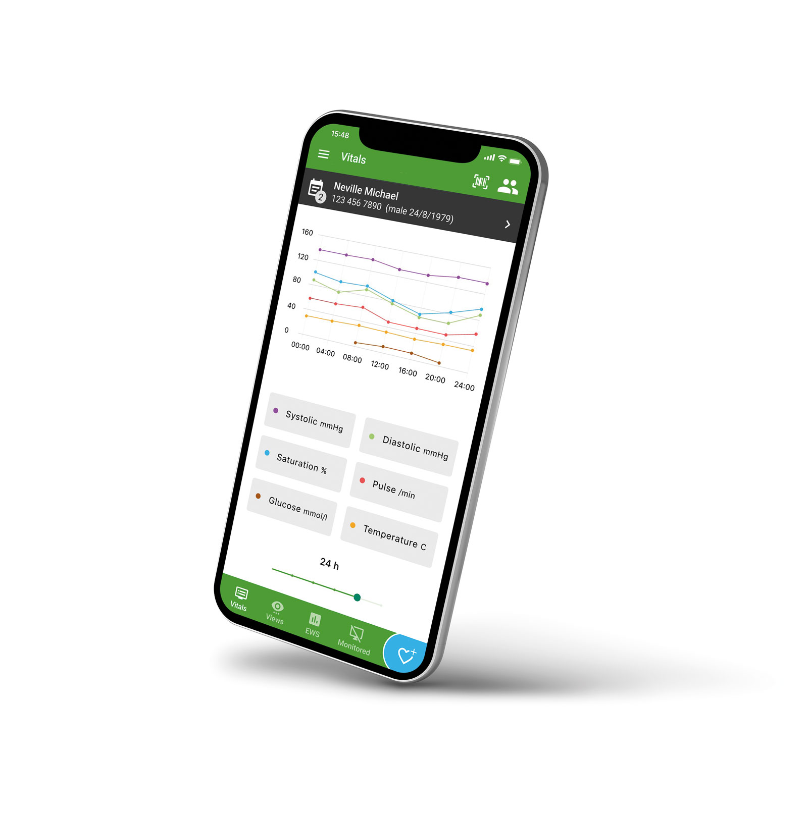
Graphs visualise the patient’s observation values as line charts over a selected period of time.
The graphs allow for viewing the patient’s observation values in a visual format. You can see how the values have developed over a selected period of time. For instance, you get to see changes in the patient’s pulse and heart rate over the past 12 hours in an easily understandable format that immediately indicates the trend. The development of the Early Warning Score can also be viewed as a graph. The graphs are integrated into the Observation values feature.
Click to enlarge